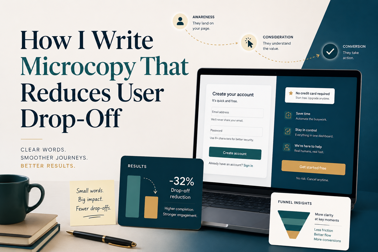
Have you ever examined your website or application analytics and noticed a significant, painful spike in user abandonment at the final step? They clicked your ads, read your beautifully written landing page, chose a service, but then—the moment they hit the intake form or payment screen—they vanished.
In digital product design, this is referred to as funnel friction, and the primary cause isn’t your product’s loading speed or price point. It is bad, confusing, or anxiety-inducing microcopy.
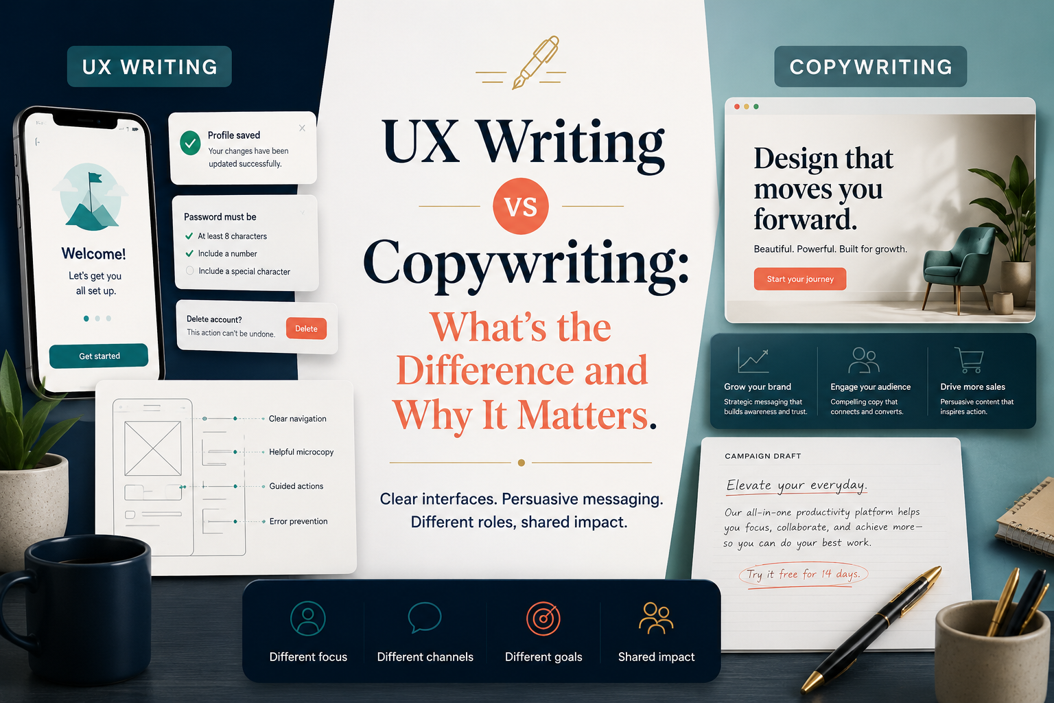
Microcopy refers to the tiny words on user interfaces: form field labels, button text, error messages, search prompts, and tooltip explanations. While small, these words carry massive conversion weight.
Here is my exact product-tested methodology for writing microcopy that eliminates user confusion, addresses cognitive anxiety, and systematically stops user drop-off.
1. Stripping Clarity Barriers from Form Fields
Forms are the ultimate conversion killers. Every additional input field you ask a user to fill out increases the cognitive load and the likelihood of abandonment. If a field is absolutely mandatory, the microcopy must make the why completely clear.
A classic mistake is using vague, generic placeholder text within form inputs. Instead, I use clear, active labels and descriptive inline hints.
- The Problem: Asking for a phone number without context. The user thinks: “Are they going to spam me with sales calls?” -> Drop-off.
- The Microcopy Fix:
- Field Label: Mobile Number
- Inline Helper Text: “Only used to send your secure doctor-patient login code via SMS.”
By explicitly giving a logical reason for data entry, you dismantle user hesitation instantly.
2. Upgrading Static Buttons to Action-Oriented Microcopy
Buttons are the literal hinges of your conversion funnel. If your primary conversion buttons still say generic things like “Submit,” “Continue,” or “Next,” you are throwing away conversions.
High-converting button microcopy should always state exactly what the user will receive or where they will land after they click. It should match the psychological expectation of that exact moment.
- Low-Conversion Copy: [ Submit ] or [ Next ]
- High-Conversion UX Copy: [ Review Booking Summary ] or [ Secure My Consultation Time ]
When users know exactly what happens on the next screen, their digital anxiety drops, and task completion rates soar.
3. Redesigning Booking and Telehealth Intake Flow Mechanics
In complex industries like healthcare and telehealth, users are often sharing sensitive personal or medical histories. Writing microcopy for these flows requires an empathetic, deeply reassuring approach.
Here is how I structure microcopy elements inside a standard medical booking engine to ensure seamless navigation:
1. Contextual Progress Indicators: Step 1 of 3: Medical Screening.
Instead of boring numbers, use descriptive labels like “Medical Briefing,” so users know the cognitive scope and depth of the current step.
2. Proactive Tooltip Placement: Why do we need this?.
Place minor interactive tooltips next to sensitive inputs (e.g., asking for an Individual Healthcare Identifier or Medicare number), explaining that encryption is fully active.
3. Constructive Error States: Fixing data inputs in real time.
Never just show a red border saying “Invalid input.” Write specific, helpful copy like “Please include the 10-digit number found on your green Medicare card.”
4. Turning Error Messages into Smooth Bridges
An error message shouldn’t feel like a dead end or an accusation. If a user inputs data incorrectly or a payment gateway fails, generic text like “Transaction Error Code 403” forces immediate abandonment because the user feels helpless.
When I draft error microcopy, I ensure it always follows three rules:
- Be polite and human: Drop the rigid computer jargon.
- Explain what went wrong: Explicitly state the exact issue.
- Provide an immediate solution: Give them a clear path forward.
Example: “We couldn’t verify this Medicare card number. Please check for typos, or choose ‘Pay Privately’ to complete your appointment setup now and update your card details later.”
Small Words, Big Impact
Optimizing your platform’s microcopy isn’t about style or flair; it’s about micro-conversions. By replacing confusion with absolute clarity and addressing unspoken user anxieties in line, you smooth out the bumps in your conversion journey. The result is a cleaner user experience, happier customers, and a significant lift in your bottom line.